Instagram gets first wordmark refresh in 10 years, but users are not impressed





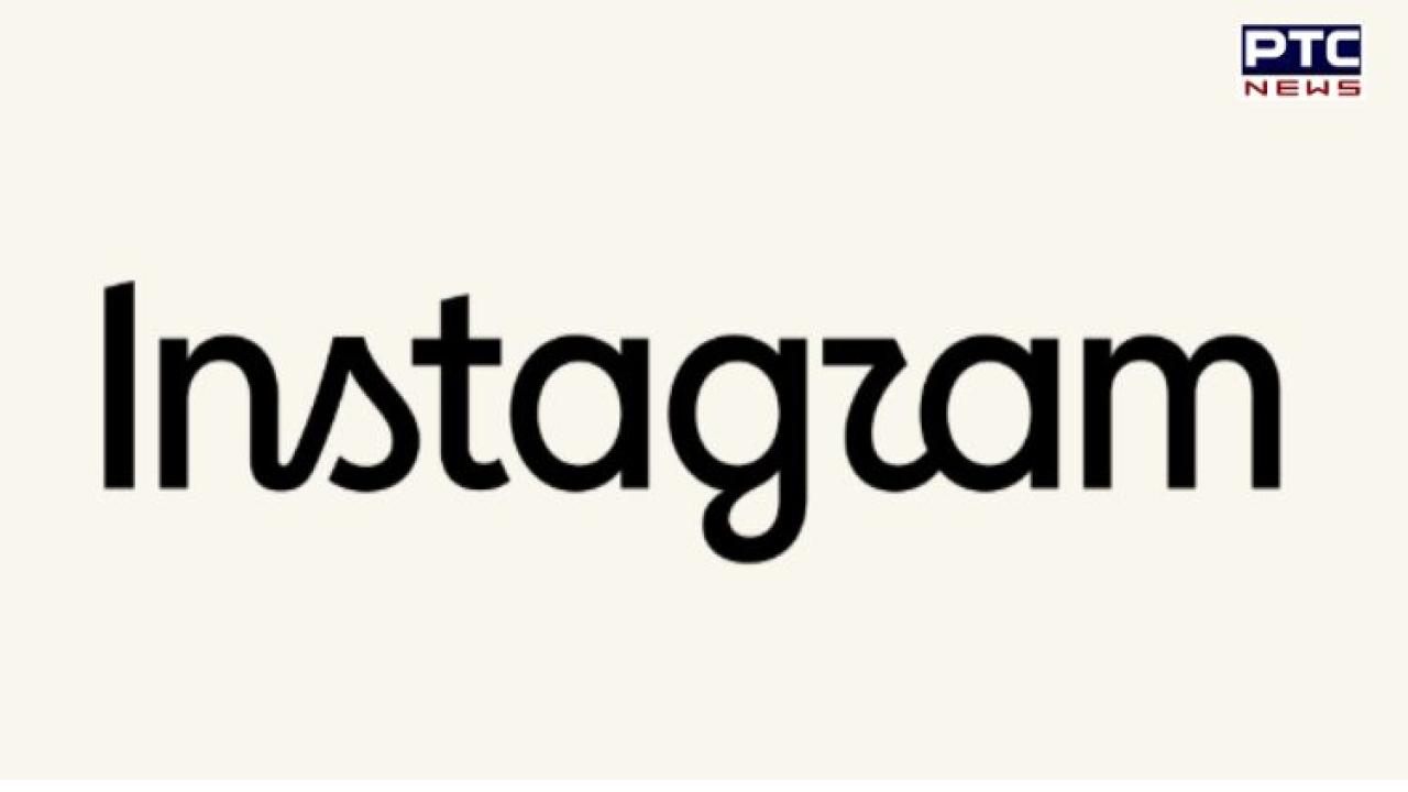
Instagram logo changed: Instagram has refreshed its wordmark for the first time in a decade, giving the familiar logo lettering a sharper and more contemporary look.
The update was announced on Thursday by Instagram head Adam Mosseri through posts on Instagram and Threads. Mosseri said the redesign was intended to make the wordmark look cleaner and more modern while retaining elements of Instagram's original visual identity.
Also Read | Craving something sweet? These guilt-free laddoos are made without refined sugar
The updated Instagram wordmark continues to use the platform's recognisable script-style lettering, but the individual letters have been redrawn.
Mosseri said the change was overdue because the wordmark displayed at the top of the Instagram app had remained largely unchanged for 10 years.
He described the refreshed design as cleaner and more modern, while saying it still reflects the simplicity and craftsmanship associated with Instagram. The company has not made a major change to the wordmark since 2016.
The latest update focuses specifically on the Instagram wordmark, rather than replacing the colourful camera icon that users are familiar with.
The lettering retains its distinctive script appearance but has been refined to give it a more polished and contemporary feel.
Instagram's broader visual identity has evolved significantly over the years. In 2016, the platform replaced its older brown camera logo with the colourful pink, purple, orange and yellow gradient icon that remains associated with the app today.
While some Instagram users welcomed the updated wordmark, the response online was far from universally positive.
Several users questioned whether the redesign was necessary, while others poked fun at the appearance of the new lettering.
One of the most common jokes was that the redesigned wordmark could be read as "Instagzam", with users pointing to the shape of the letter "r" in the updated font.
Despite the criticism, Instagram's latest move is a relatively small visual change rather than a complete rebranding.
The company has retained the script-based character of its name while making subtle changes to the letterforms.
- With inputs from agencies